LAS COSAS CLARAS... DESDE EL PRINCIPIO
Nos gustan las cosas claras... optimizamos los tiempos y los recursos empleados para que el precio sea justo. Si estás en A Coruña, nos vemos, tomamos un café y nos cuentas tu idea. Si estás fuera, quedamos por videollamada... sin complicaciones.
01
Toma de contacto
En la primera toma de contacto nos centraremos en conocer tu idea y el alcance del desarrollo a realizar. Necesitaremos conocer todo de tu empresa, tus puntos fuertes y los que necesitan potenciar, etc...

02
Envío de propuesta
En este paso, planificaremos las bases del proyecto y te enviaremos un presupuesto ajustado a tus necesidades ofreciéndote, de manera clara, todas las opciones disponibles...

03
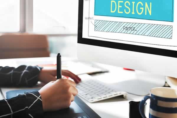
Presentación de bocetos
Una vez aceptado el presupuesto, te presentaremos un boceto basado en imágenes de varias pantallas de la web a desarrollar. Este es el momento de comentar todas las modificaciones o mejores que consideres oportunas e intercambiemos ideas.
04
Maquetación y programación
Ya cerrado el diseño, nos ponemos manos a la obra con la programación y maquetación CSS de tu nueva página web respetando las especificaciones planteadas. Obtendrás una web "responsive" que se adapta a todos los dispositivos y, según opciones, 100% autogestionable con un Gestor de Contenidos CMS desarrollado a medida.

05
Revisión y publicación
Cuando hemos terminado el desarrollo, haremos todas las pruebas necesarias para verificar su correcto funcionamiento y te daremos un enlace provisional para que puedas echarle un vistazo. Comentaremos ajustes a realizar y, una vez que todo está listo, la publicaremos en el alojamiento web.

06
Mantenimiento y garantía
Lógicamente, tu nueva web contará con la garantía necesaria contra pequeños fallos que pudieran aparecer o ajustes a realizar según la configuración del alojamiento. En ningún caso te obligaremos a contratar un mantenimiento mensual o pago mensual por el funcionamiento de la web.